https://www.youtube.com/watch?v=jnoKa44OZv8
https://colab.research.google.com/drive/18az5ur4JDVwxJz9nQfLMylVJM1fG1iND?usp=sharing
_5 의미 연결망 분석(Semantic Network Analysis).ipynb
Colaboratory notebook
colab.research.google.com
의미 연결망 분석(Semantic Network Analysis)
- 사회 연결망 분석(Social Network Analysis)는 분석 대상 및 분석 대상들간의 관계를 연결망 구조로 표현하고 이를 계량적으로 제시하는 분석 기법
- 사회 연결망 분석은 사람, 장소, 물품 등의 객체 간의 관계를 분석하는데 효과적이며 주로 친구 관계, 전력 공급 등을 분석하는데 사용
- 사회 연결망 분석 기법을 텍스트 내 단어의 관계에 적용한 것이 바로 의미 연결망 분석
- 의미 연결망 분석에서는 일정한 범위 내에서 어휘가 동시에 등장하면 서로 연결된 것으로 간주, 이 연결 관계들을 분석
n-gram
- nltk 라이브러리는 편하게 n-gram을 생성할 수 있는 함수를 제공
- 많이 사용되는 bigrams의 경우에는 별도의 함수를 제공하니 해당 내용을 참조하여 n-gram 생성
- window size가 2보다 큰 경우 ngram 함수에 window size를 인자로 넣어 사용가능
import nltk
nltk.download("punkt")


from nltk import word_tokenize, bigrams

sentence = "I love data science and deep learning"
tokens = word_tokenize(sentence)

bgram = bigrams(tokens)
bgram_list = [x for x in bgram]
print(bgram_list)
# [('I', 'love'), ('love', 'data'), ('data', 'science'), ('science', 'and'), ('and', 'deep'), ('deep', 'learning')]


from nltk.util import ngrams

tgram = ngrams(tokens, 3) # trigram
qgram = ngrams(tokens, 4) # quadgram

tgram_list = [x for x in tgram]
qgram_list = [x for x in qgram]
print(tgram_list)
# [('I', 'love', 'data'), ('love', 'data', 'science'), ('data', 'science', 'and'), ('science', 'and', 'deep'), ('and', 'deep', 'learning')]
print(qgram_list)
# [('I', 'love', 'data', 'science'), ('love', 'data', 'science', 'and'), ('data', 'science', 'and', 'deep'), ('science', 'and', 'deep', 'learning')]
어휘 동시 출현 빈도의 계수화
- 동시 출현(Co-occurrence)란 두 개 이상의 어휘가 일정한 범위나 거리 내에서 함께 출현하는 것을 의미
- 단어간의 동시 출현 관계를 분석하면 문서나 문장으로부터 두 단어가 유사한 의미를 가졌는지 등의 추상화된 정보를 얻을 수 있음
- 동시 출현 빈도는 Window라는 지정 범위 내에서 동시 등장한 어휘를 확률 등으로 계수화 가능
- 예를 들어, 단어 뒤 잘못된 단어가 온다면, 이를 동시 출현 빈도가 높은 단어로 교정 가능
- 어휘 동시 출현 빈도 행렬은 하나하나 측정할 수도 있지만, 바이그램 개수를 정리하면 편리하게 만들어 볼 수 있음
- nltk에서 제공하는 ConditionalFreqDist 함수를 이용하면 문맥별 단어 빈도를 쉽게 측정 가능
import numpy as np

freq_matrix = []

for i in cfd.keys() :
    temp = []
    for j in cfd.keys() :
        temp.append(cfd[i][j])
    freq_matrix.append(temp)
freq_matrix = np.array(freq_matrix)

print(cfd.keys()) # dict_keys(['I', 'love', 'data', 'science', 'and', 'deep', 'learning', 'know', 'this', 'code'])
print(freq_matrix)
# [[0 2 0 0 0 0 0 1 0 0]
# [0 0 1 1 0 0 0 0 0 0]
# [0 0 0 1 0 0 0 0 0 0]
# [0 0 0 0 1 0 0 0 0 0]
# [0 0 0 0 0 1 0 0 0 0]
# [0 0 0 0 0 0 1 0 0 0]
# [0 0 0 0 0 0 0 0 0 0]
# [0 0 0 0 0 0 0 0 1 0]
# [0 0 0 0 0 0 0 0 0 1]
# [0 0 0 0 0 0 0 0 0 0]]
- 해당 동시 출현 빈도 행렬을 좀 더 보기 쉽도록 데이터프레임으로 시각화
import pandas as pd

df = pd.DataFrame(freq_matrix, index = cfd.keys(), columns = cfd.keys())
df.style.background_gradient(cmap="coolwarm")
그런데 VScode에서는 이게 예쁜 그래프로 안 나오고
<pandas.io.formats.style.Styler object at 0x0000026686CA5400> 이런 메세지만 뜬다...
알고보니 pandas의 Dataframe에서의 style 기능은 쥬피터노트북처럼 HTML 백엔드가 있는 곳에서만 사용 가능하다고? 합니다,,
python - How to Style Pandas Dataframe(color)? - Stack Overflow
How to Style Pandas Dataframe(color)?
import pandas as pd import numpy as np np.random.seed(24) df = pd.DataFrame({'A': np.linspace(1, 10, 10)}) df = pd.concat([df, pd.DataFrame(np.random.randn(10, 4), columns=list('BCDE'))], ...
stackoverflow.com
>>> print(df)
#           I  love  data  science  and  deep  learning  know  this  code
# I         0     2     0        0    0     0         0     1     0     0
# love      0     0     1        1    0     0         0     0     0     0
# data      0     0     0        1    0     0         0     0     0     0
# science   0     0     0        0    1     0         0     0     0     0
# and       0     0     0        0    0     1         0     0     0     0
# deep      0     0     0        0    0     0         1     0     0     0
# learning  0     0     0        0    0     0         0     0     0     0
# know      0     0     0        0    0     0         0     0     1     0
# this      0     0     0        0    0     0         0     0     0     1
# code 0 0 0 0 0 0 0 0 0 0- 동시 출현 빈도 행렬은 인접 행렬로도 간주할 수 있음
- networkx 라이브러리를 사용해 해당 행렬을 그래프로 시각화
- 앞서 만든 데이터프레임을 그래프로 변환
- 넘파이 배열 등으로도 가능하나, 이 경우 별도로 라벨을 지정해줘야만 함
import networkx as nx

G = nx.from_pandas_adjacency(df)

print(G.nodes()) # ['I', 'love', 'data', 'science', 'and', 'deep', 'learning', 'know', 'this', 'code']
print(G.edges())
# [('I', 'love'), ('I', 'know'), ('love', 'data'), ('love', 'science'), ('data', 'science'), ('science', 'and'), ('and', 'deep'), ('deep', 'learning'), ('know', 'this'), ('this', 'code')]
- 각 엣지에 접근해보면 각 엣지의 가중치에 각 단어간의 빈도가 사용된 것을 확인 가능
print(G.edges()[('I', 'love')]) # {'weight': 2}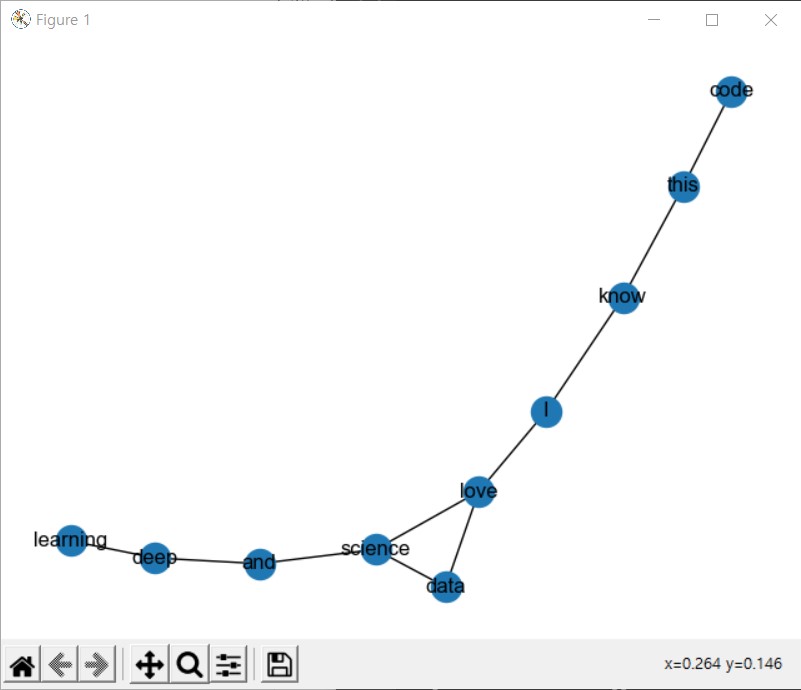
print(G.edges()[('I', 'know')]) # {'weight': 1}- nx.draw를 통해 간편하게 그래프를 시각화할 수 있음
그러나 실행해보니 이것도 VScode에서는 불가능한듯,,
nx.draw(G, with_labels=True)방법 찾음! 그냥 matplotlib.pyplot plt로 import 한 뒤에 plt.show() 누르면 된답니다....
- 어휘 동시 출현 빈도를 이용하면 어휘 동시 출현 확률까지 측정 가능
- 어휘 동시 출현 확률 계산에는 nltk의 ConditionalProbDist를 이용
from nltk.probability import ConditionalProbDist, MLEProbDist

cpd = ConditionalProbDist(cfd, MLEProbDist)
cpd.conditions() # ['I', 'love', 'data', 'science', 'and', 'deep', 'learning', 'know', 'this', 'code']
prob_matrix = []

for i in cpd.keys():
    prob_matrix.append([cpd[i].prob(j) for j in cpd.keys()])

prob_matrix = np.array(prob_matrix)

print(cpd.keys()) # dict_keys(['I', 'love', 'data', 'science', 'and', 'deep', 'learning', 'know', 'this', 'code'])
print(prob_matrix)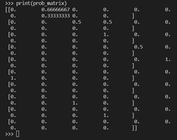
데이터프레임 부분은 생략,, 안 뜨므로ㅜ
- 확률 행렬도 인접 행렬로 간주할 수 있음
- 그래프 시각화시 빈도 행렬과 동일한 결과를 얻을 수 있으나, 확률을 가중치로 사용시 부정확한 결과를 얻을 수 있음
prob_G = nx.from_pandas_adjacency(df)

print(prob_G.nodes())
# ['I', 'love', 'data', 'science', 'and', 'deep', 'learning', 'know', 'this', 'code']
print(prob_G.edges())
# [('I', 'love'), ('I', 'know'), ('love', 'data'), ('love', 'science'), ('data', 'science'), ('science', 'and'), ('and', 'deep'), ('deep', 'learning'), ('know', 'this'), ('this', 'code')]

print(prob_G.edges()[('I', 'love')]) # {'weight': 0.6666666666666666}
print(prob_G.edges()[('I', 'know')]) # {'weight': 0.3333333333333333}
이전에 G.edges로만 각 엣지에 접근했을 때는 가중치가 일반적인 개수로 출력된 것과 비교하면 이 경우에는 확률로 제시되는 것 확인 가능! 확률을 가중치 값으로 갖는 edge임.
nx.draw(prob_G, with_labels=True)근데 듣다보니 이수안씨 목소리가 좋네요..
중심성(Centrality) 지수
- 연결망 분석에서 가장 많이 주목하는 속성은 바로 중심성 지수
- 중심성은 전체 연결망에서 중심에 위치하는 정도를 표현하는 지표로, 이를 분석하면 연결 정도, 중요도 등을 알 수 있음
- 중심성 지수는 나타내는 특징에 따라 연결 중심성, 매개 중심성, 근접 중심성, 위세 중심성으로 구분
a. 연결 중심성(Degree Centrality)
- 연결 중심성은 가장 기본적이고 직관적으로 중심성을 측정하는 지표
- 텍스트에서 다른 단어와의 동시 출현 빈도가 많은 특정 단어는 연결 중심성이 높다고 볼 수 있음
- 연결 정도로만 측정하면 연결망의 크기에 따라 달라져 비교가 어렵기 때문에 여러 방법으로 표준화
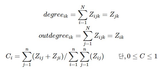
- 주로 (특정 노드 i와 직접적으로 연결된 노드 수 / 노드 i와 직간접적으로 연결된 노드 수)로 계산
- 여기서 직접적으로 연결된 노드는 서로 엣지 관계인 노드를 뜻하며, 간접적으로 연결된 노드는 서로 엣지 관계는 아니나 다른 노드와 엣지에 의해 도달할 수 있는 노드를 말함
- 연결 중심성 계산 수식
- 해당 수식을 직접 계산할 수도 있으나,
networkx에는 해당 라이브러리로 구성된 그래프의 연결 중심성을 쉽게 계산해주는 함수가 존재
nx.degree_centrality(G)
# {'I': 0.2222222222222222, 'love': 0.3333333333333333, 'data': 0.2222222222222222, 'science': 0.3333333333333333, 'and': 0.2222222222222222, 'deep': 0.2222222222222222, 'learning': 0.1111111111111111, 'know': 0.2222222222222222, 'this': 0.2222222222222222, 'code': 0.1111111111111111}
b. 위세 중심성 (Eigenvector Centrality)
- 위세 중심성은 연결된 상대 단어의 중요성에 가중치를 둠
- 중요한 단어와 많이 연결됐다면 위세 중심성은 높아지게 됨
- 위세 중심성은 고유 벡터로써 인접해 있는 노드의 위세 점수와 관련되어 있어 직접 계산하기는 쉽지 않음
- 위세 중심성 계산에는 eigenvector_centrality를 이용해 계산
- weight로는 어휘 동시 출현 빈도를 이용
nx.eigenvector_centrality(G, weight='weight')
# {'I': 0.5043225195054015, 'love': 0.6170801401174913, 'data': 0.35539858554300846, 'science': 0.397393105912265, 'and': 0.16186494343217359, 'deep': 0.06464106232240265, 'learning': 0.022646541953146138, 'know': 0.20541476371192083, 'this': 0.08202944079727896, 'code': 0.028736992509478948}
c. 근접 중심성 (Closeness Centrality)
- 근접 중심성은 한 단어가 다른 단어에 얼마나 가깝게 있는지를 측정하는 지표
- 직접적으로 연결된 노드만 측정하는 연결 중심성과는 다르게, 근접 중심성은 직간접적으로 연결된 모든 노드들 사이의 거리를 측정
- 근접 중심성을 측정하기 위해선 다음과 같이 계산: (모든 노드 수 -1 / 특정 노드 i에서 모든 노드에 이르는 최단 경로 수를 모두 더한 수)
- 근접 중심성을 계산하기 위해선 closeness_centrality() 함수를 이용
nx.closeness_centrality(G, distance='weight')
# {'I': 0.3103448275862069, 'love': 0.36, 'data': 0.3103448275862069, 'science': 0.34615384615384615, 'and': 0.3, 'deep': 0.25, 'learning': 0.20454545454545456, 'know': 0.2727272727272727, 'this': 0.23076923076923078, 'code': 0.19148936170212766}
d. 매개 중심성 (Betweeness Centrality)
- 매개 중심성은 한 단어가 단어들과의 연결망을 구축하는데 얼마나 도움을 주는지 측정하는 지표
- 매개 중심성이 높은 단어는 빈도 수가 작더라도 단어 간 의미부여 역할이 크기 때문에, 해당 단어를 제거하면 의사소통이 어려워짐
- 매개 중심성은 모든 노드 간 최단 경로에서 특정 노드가 등장하는 횟수로 측정하며, 표준화를 위해 최댓값인 (N-1)*(N-2) / 2 로 나눔.
- 매개 중심성을 계산하기 위해서 current_flow_betweenness_centrality() 함수를 이용
nx.betweenness_centrality(G)
# {'I': 0.5, 'love': 0.5555555555555556, 'data': 0.0, 'science': 0.5, 'and': 0.38888888888888884, 'deep': 0.2222222222222222, 'learning': 0.0, 'know': 0.38888888888888884, 'this': 0.2222222222222222, 'code': 0.0}
페이지 랭크
- 월드 와이드 웹과 같은 하이퍼링크 구조를 가지는 문서에 상대적 중요도에 따라 가중치를 부여하는 방법
- 이 알고리즘은 서로간에 인용과 참조로 연결된 임의의 묶음에 적용 가능
- 페이지 랭크는 더 중요한 페이지는 더 많은 다른 사이트로부터 링크를 받는다는 관찰에 기초
nx.pagerank(G)
# {'I': 0.11983449095516849, 'love': 0.15267378843271698, 'data': 0.08225239909174781, 'science': 0.12285631269826083, 'and': 0.09519159035030053, 'deep': 0.1067804394189322, 'learning': 0.06038210127810334, 'know': 0.09399820991688976, 'this': 0.10598595479696662, 'code': 0.060044713060913274}
이제 이렇게 우리가 본 노드 사이 중요도 / 랭킹 차이를 노드의 사이즈에 반영하여 시각화를 해볼 것임
그러기 위해서 사이즈를 나타내는 함수를 정의할 것
def get_node_size(node_val):
    nsize = np.array([v for v in node_val])
    nsize = 1000 * (nsize - min(nsize)) / (max(nsize) - min(nsize))

    return nsize

import matplotlib.pyplot as plt
plt.style.use('seaborn-white')

dc = nx.degree_centrality(G).values()
ec = nx.eigenvector_centrality(G, weight='weight').values()
cc = nx.closeness_centrality(G, distance='weight').values()
bc = nx.betweenness_centrality(G).values()
pr = nx.pagerank(G).values()

plt.figure(figsize=(14,20))
plt.axis(off)

plt.subplot(321)
plt.title('Normal', fontsize=16)
nx.draw_networkx(G, font_size=16, alpha=0.7, cmap=plt.cm.Blues)

plt.subplot(322)
plt.title('Degree Centrality', fontsize=16)
nx.draw_networkx(G, font_size=16, node_color=list(dc), node_size=get_node_size(dc), alpha=0.7, cmap=plt.cm.Blues)

plt.subplot(323)
plt.title('Eigenvector Centrality', fontsize=16)
nx.draw_networkx(G, font_size=16, node_color=list(ec), node_size=get_node_size(ec), alpha=0.7, cmap=plt.cm.Blues)

plt.subplot(324)
plt.title('Closeness Centrality', fontsize=16)
nx.draw_networkx(G, font_size=16, node_color=list(cc), node_size=get_node_size(cc), alpha=0.7, cmap=plt.cm.Blues)

plt.subplot(325)
plt.title('Betweenness Centrality', fontsize=16)
nx.draw_networkx(G, font_size=16, node_color=list(bc), node_size=get_node_size(bc), alpha=0.7, cmap=plt.cm.Blues)

plt.subplot(326)
plt.title('Page Rank', fontsize=16)
nx.draw_networkx(G, font_size=16, node_color=list(pr), node_size=get_node_size(pr), alpha=0.7, cmap=plt.cm.Blues)

plt.show()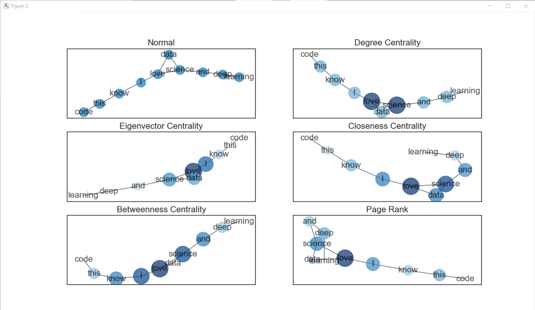
그리고 연결망의 레이아웃 (모양)을 다르게 설정할 수도 있음!
pl = nx.planar_layout(G)
frl = nx.fruchterman_reingold_layout(G)
sl = nx.spectral_layout(G)
rl = nx.random_layout(G)
shl = nx.shell_layout(G)
bl = nx.bipartite_layout(G, G.nodes())
cl = nx.circular_layout(G)
spl = nx.spring_layout(G)
kkl = nx.kamada_kawai_layout(G)

option = {
    'font_size' : 16,
    'node_color' : list(pr),
    'node_size' : get_node_size(pr),
    'alpha' : 0.7,
    'cmap' : plt.cm.Blues
}

plt.figure(figsize=(15,15))
plt.axis('off')

plt.subplot(331)
plt.title('planar_layout', fontsize=16)
nx.draw_networkx(G, pos=pl, **option)

plt.subplot(332)
plt.title('fruchterman_reingold_layout', fontsize=16)
nx.draw_networkx(G, pos=frl, **option)

plt.subplot(333)
plt.title('spectral_layout', fontsize=16)
nx.draw_networkx(G, pos=sl, **option)

plt.subplot(334)
plt.title('random_layout', fontsize=16)
nx.draw_networkx(G, pos=rl, **option)

plt.subplot(335)
plt.title('shell_layout', fontsize=16)
nx.draw_networkx(G, pos=shl, **option)

plt.subplot(336)
plt.title('bipartite_layout', fontsize=16)
nx.draw_networkx(G, pos=bl, **option)

plt.subplot(337)
plt.title('circular_layout', fontsize=16)
nx.draw_networkx(G, pos=cl, **option)

plt.subplot(338)
plt.title('spring_layout', fontsize=16)
nx.draw_networkx(G, pos=spl, **option)

plt.subplot(339)
plt.title('kamada_kawai_layout', fontsize=16)
nx.draw_networkx(G, pos=kkl, **option)

plt.show()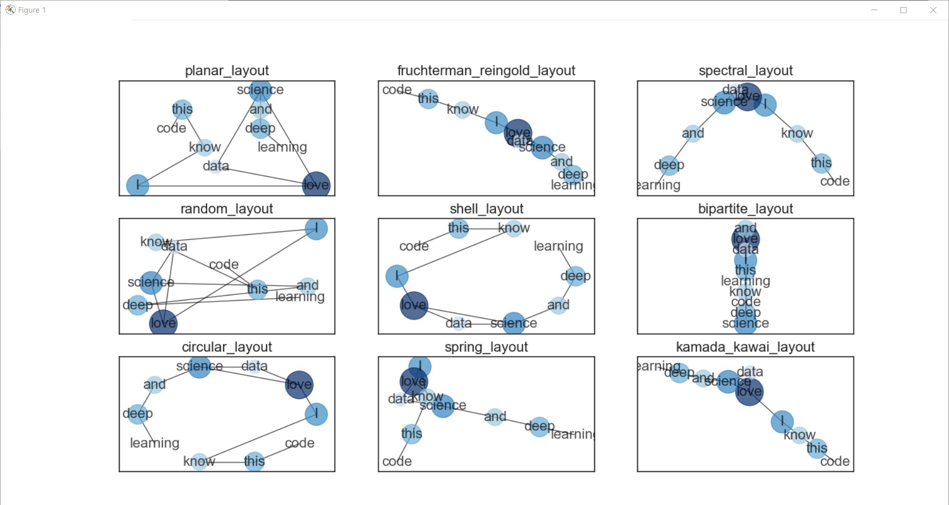
꺅 >.<~~~
'Computer > ML·DL·NLP' 카테고리의 다른 글
| [이수안컴퓨터연구소] 토픽 모델링 Topic Modeling (0) | 2022.01.08 |
|---|---|
| [스크랩] XGBoost 뿌수기! (0) | 2021.10.25 |
| [이수안컴퓨터연구소] 문서 분류 Document Classification (0) | 2021.08.07 |
| [이수안컴퓨터연구소] 군집 분석 Cluster Analysis (0) | 2021.08.04 |
| [이수안컴퓨터연구소] 키워드 분석 Keyword Analysis (0) | 2021.08.04 |


댓글